BACK

The Images Festival is held annually in Toronto and displays exhibitions of independent film and media art. This fictional rebranding project introduces a flexible branding system that communicates the experimental nature of the festival to a young adult audience.
Drawing inspiration from the festival's film, video, and media art roots, the festival's brochure and poster are redesigned using bright colours, an edge-to-edge layering layout, and image manipulation. Awarded the Applied Arts Promotional Design Award (2022) & RGD Honourable Mention for Brand Design (2022)
Timeline
Sept-Dec 2021 (14 weeks)
Role
Concepting, Designing
Tools
Adobe Illustrator, InDesign, & Photoshop
The Challenge
How can the Images Festival identity be redesigned for an 18-34 year old demographic and connote the nature of the festival?
The Solution
An edgy, experimental, bilingual design system that expresses the festival and can be applied to all forms of visual communication.
The system of the bilingual festival program is set that the background and image colour treatments are determined by the category/type of festival events: Screenings, Performances, Installations, and Artist Talks. Black type is combined with tiles of white type, which creates an interesting rhythm, drawing and leading the eye to different aspects of the content.
A six column by two row grid system organizes the festival content into four columns per spread. Images follow a system of at least one small image on the opening verso page of new event spreads and all images are monotone. For clarity and ease of use, the event schedule is accessible on the inside front cover and gate fold-out. The map of even locations is on the inside back cover and gate fold-out.
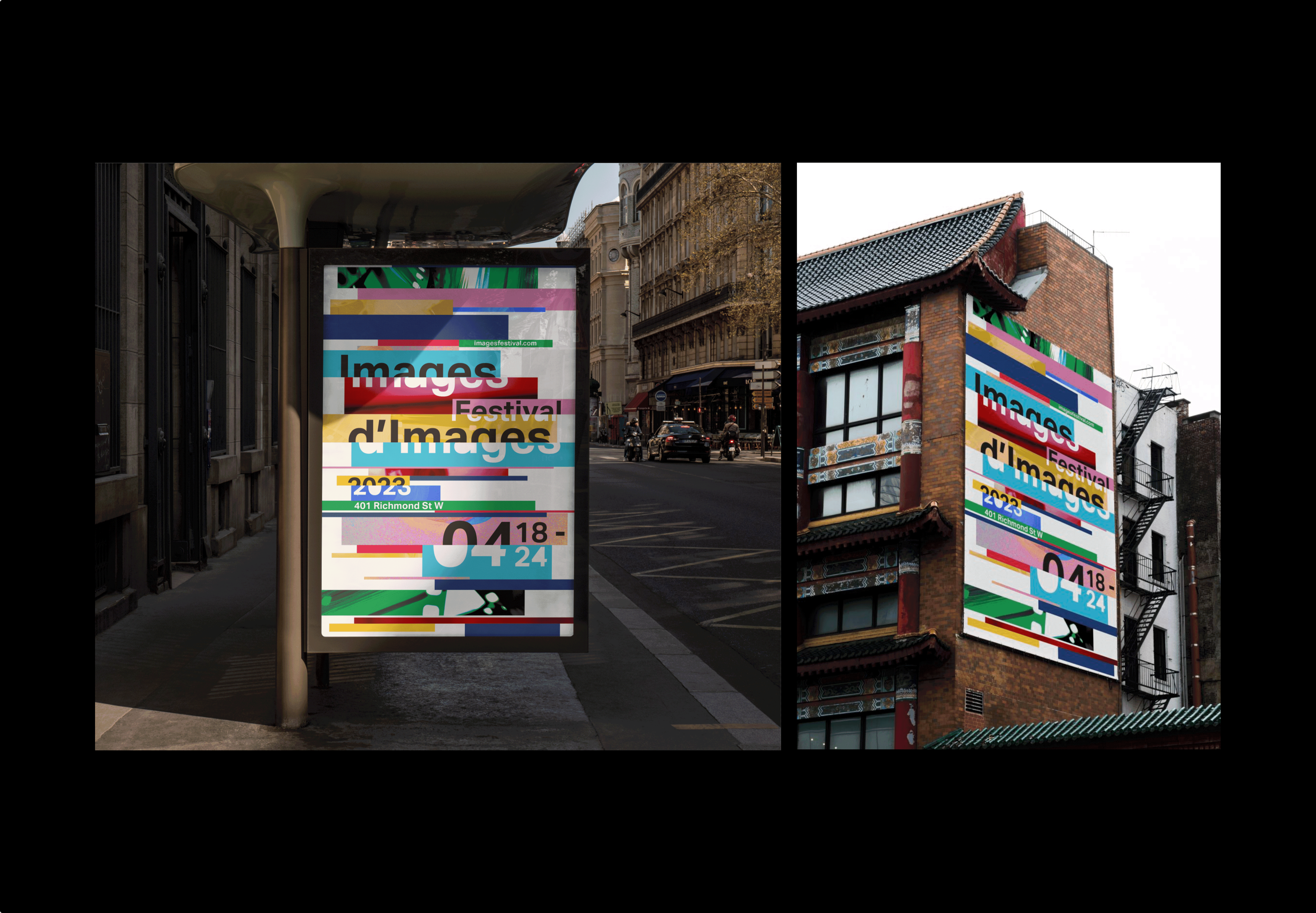
Inspired by the 'Please Stand By' colour bars of retro television, the horizontal bars symbolize moving image content and their glitch-like positioning expresses the edgy and experimental aspects of multimedia content. The same colour bar palette is consistently present throughout all modes of communication for cohesion - the 8" x 5.5" festival program and 20" x 30" festival poster.
![]()
Festival Poster
My own photography of an unusable canister of film with distorted colour levels fit into various bars of the composition and portions of the poster's typography is knocked-out, inspired by the holes that line the edges of film rolls, to add depth and texture to the poster and overall visual identity of the festival. The poster is also bilingual, since the two translations have "Festival" in common, the design shares the "Festival" between the two "Images" translations.
The final festival identity was developed through an extensive design and ideation process. The design of the festival's poster was created first and lead the overall identity. Multiple variations and styles of the poster were experimented with from abstract visual expressions to representational expressions.