BACK

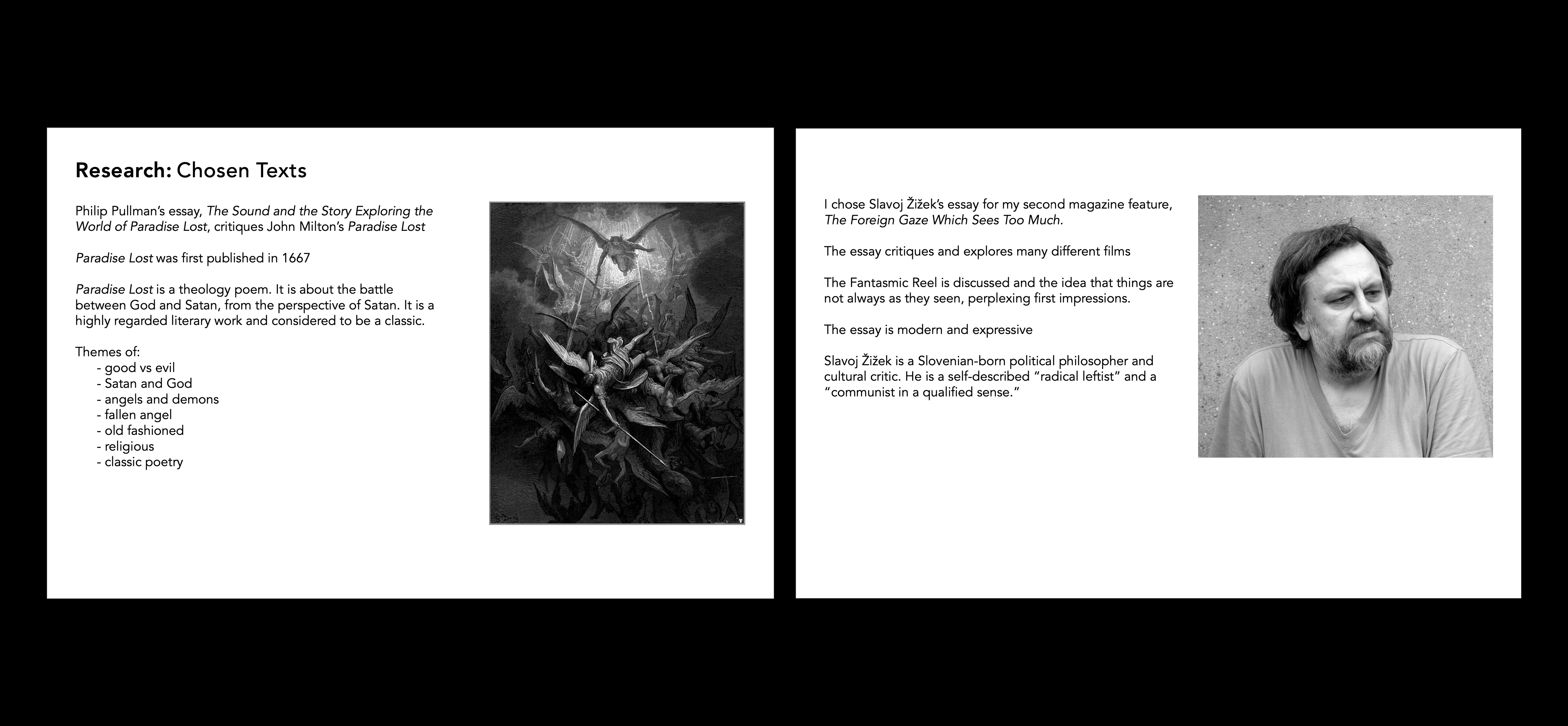
A collection of spreads utilizing two essays: The Sound and the Story Exploring the World of Paradise Lost by Philip Pullman, and The Foreign Gaze Which Sees Too Much by Slavoj Zizek are designed features presented in the same magazine.
Timeline
Nov 2020 (4 weeks)
Role
Editorial Designer
Tools
Adobe InDesign
The Challenge
How can features within the same magazine be consistent, yet unique from each other?
The Solution
A design system that emphasizes body copy consistency and the utilization of expressive typography throughout titles and headings.
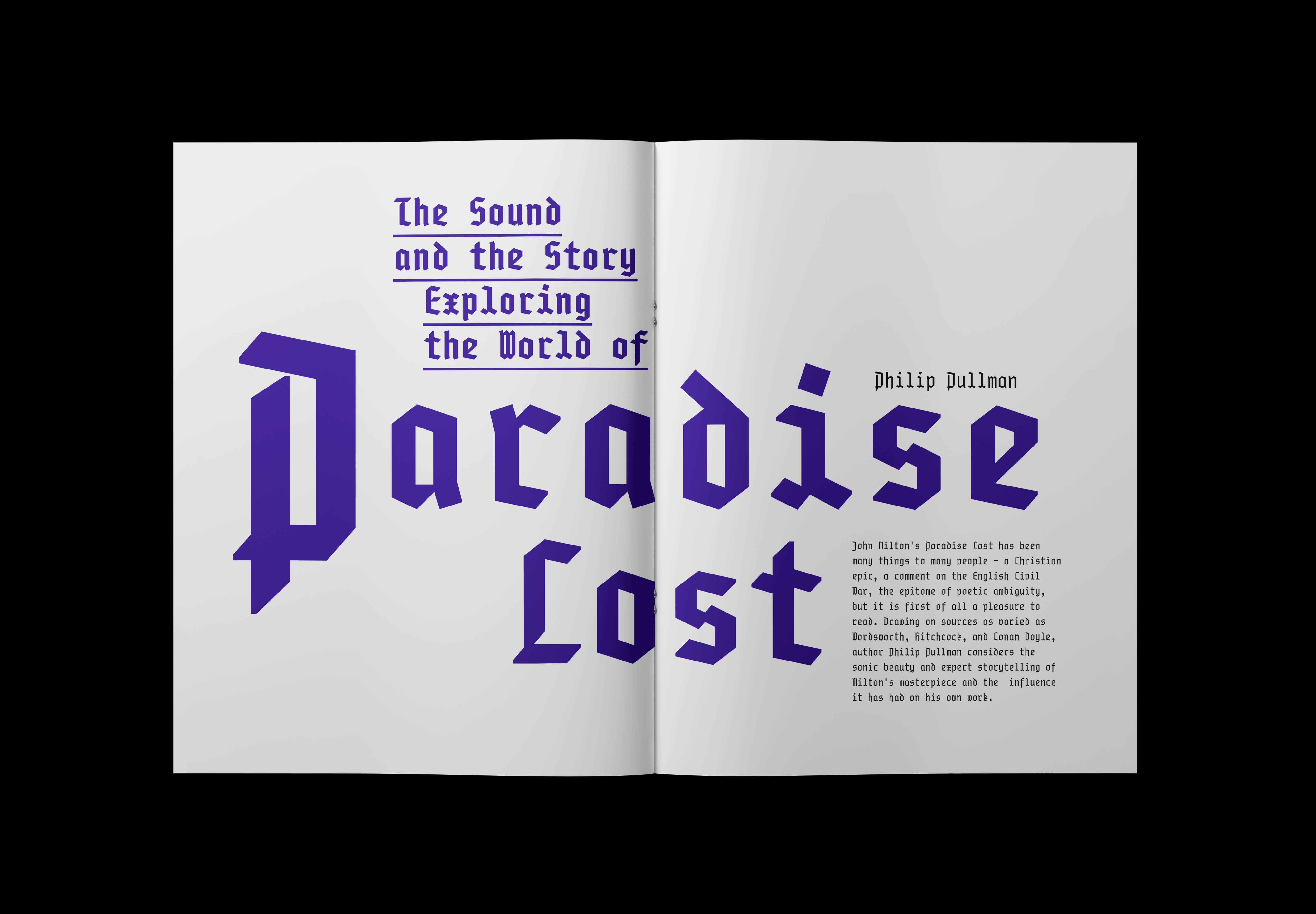
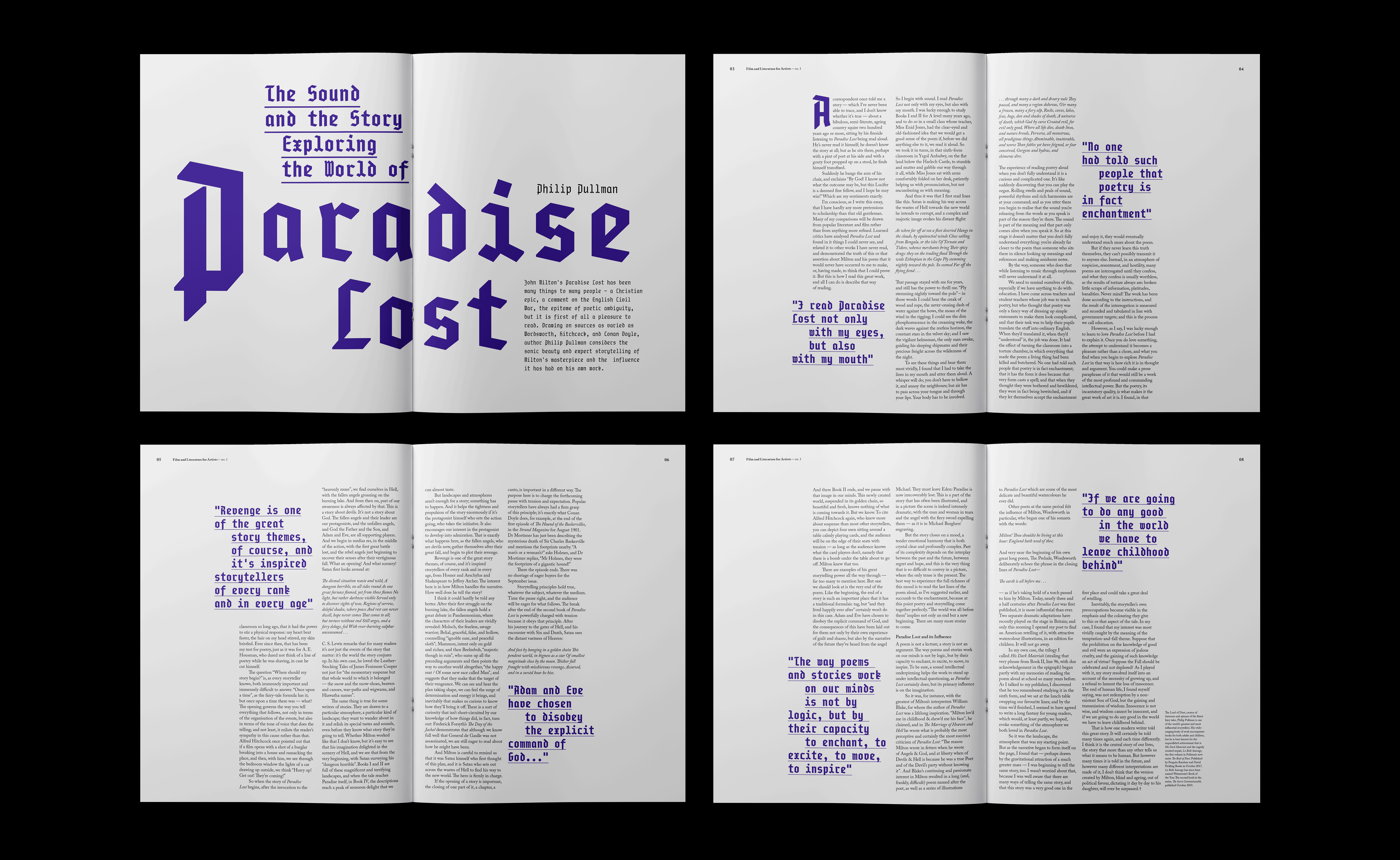
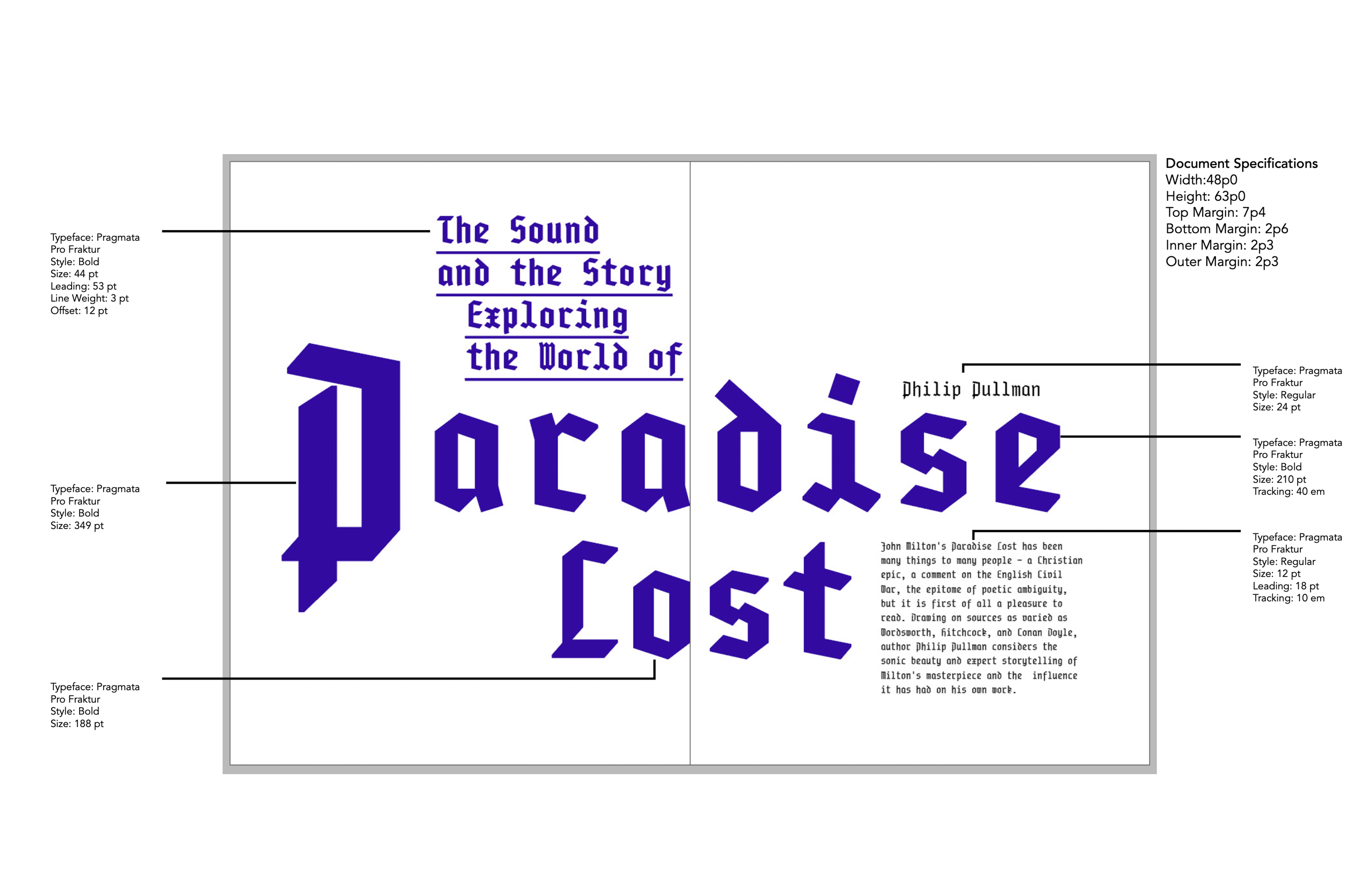
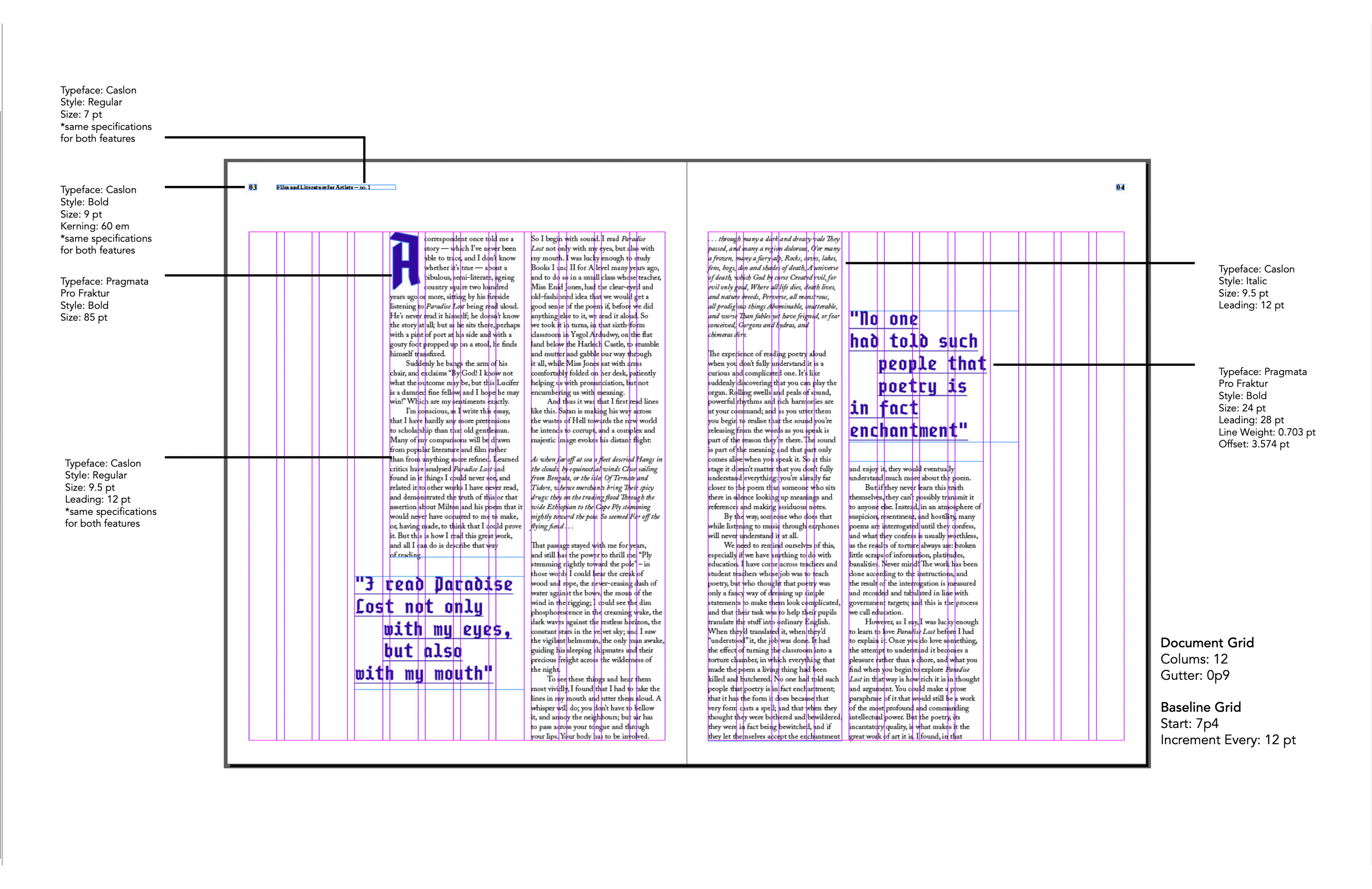
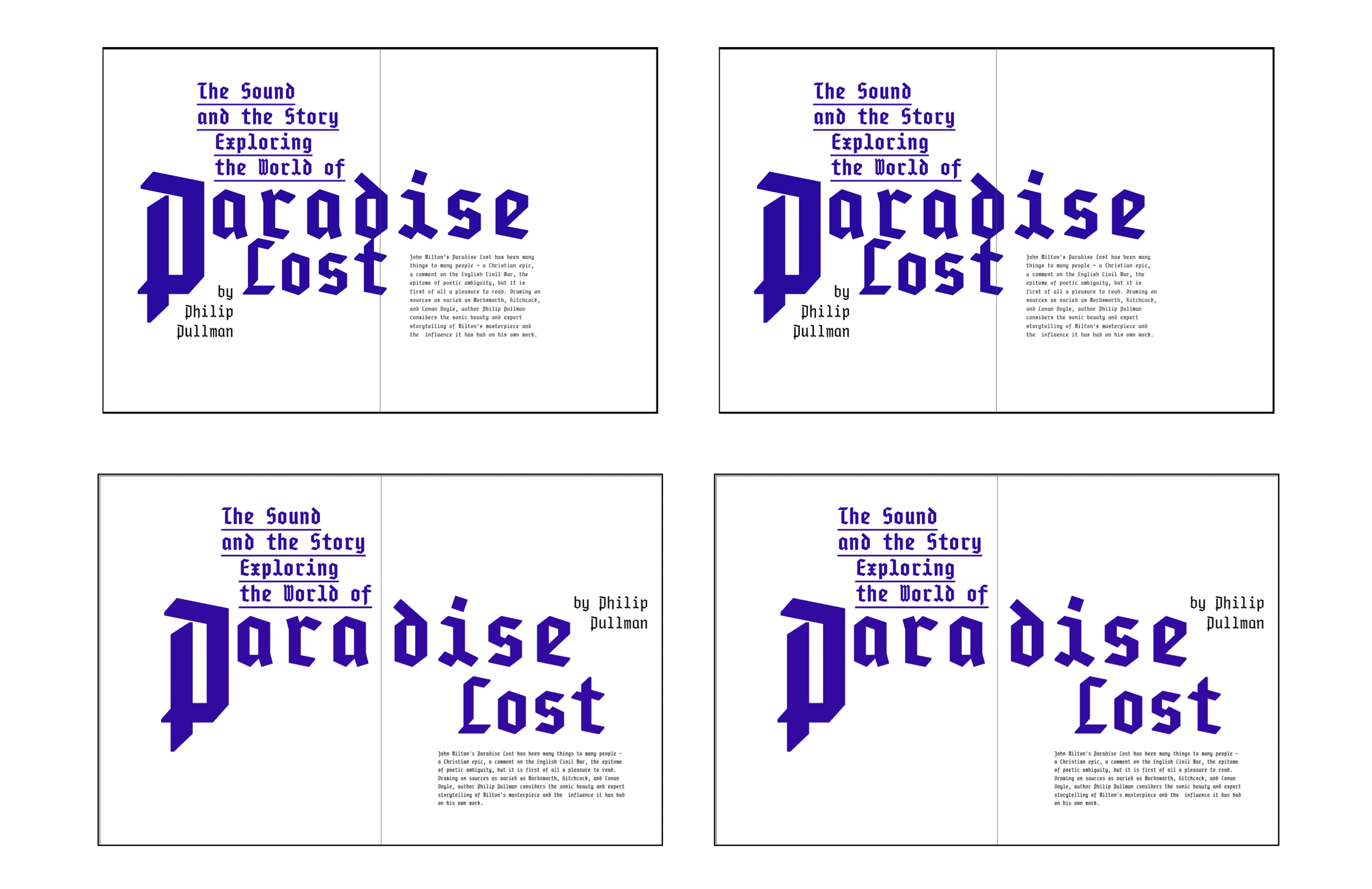
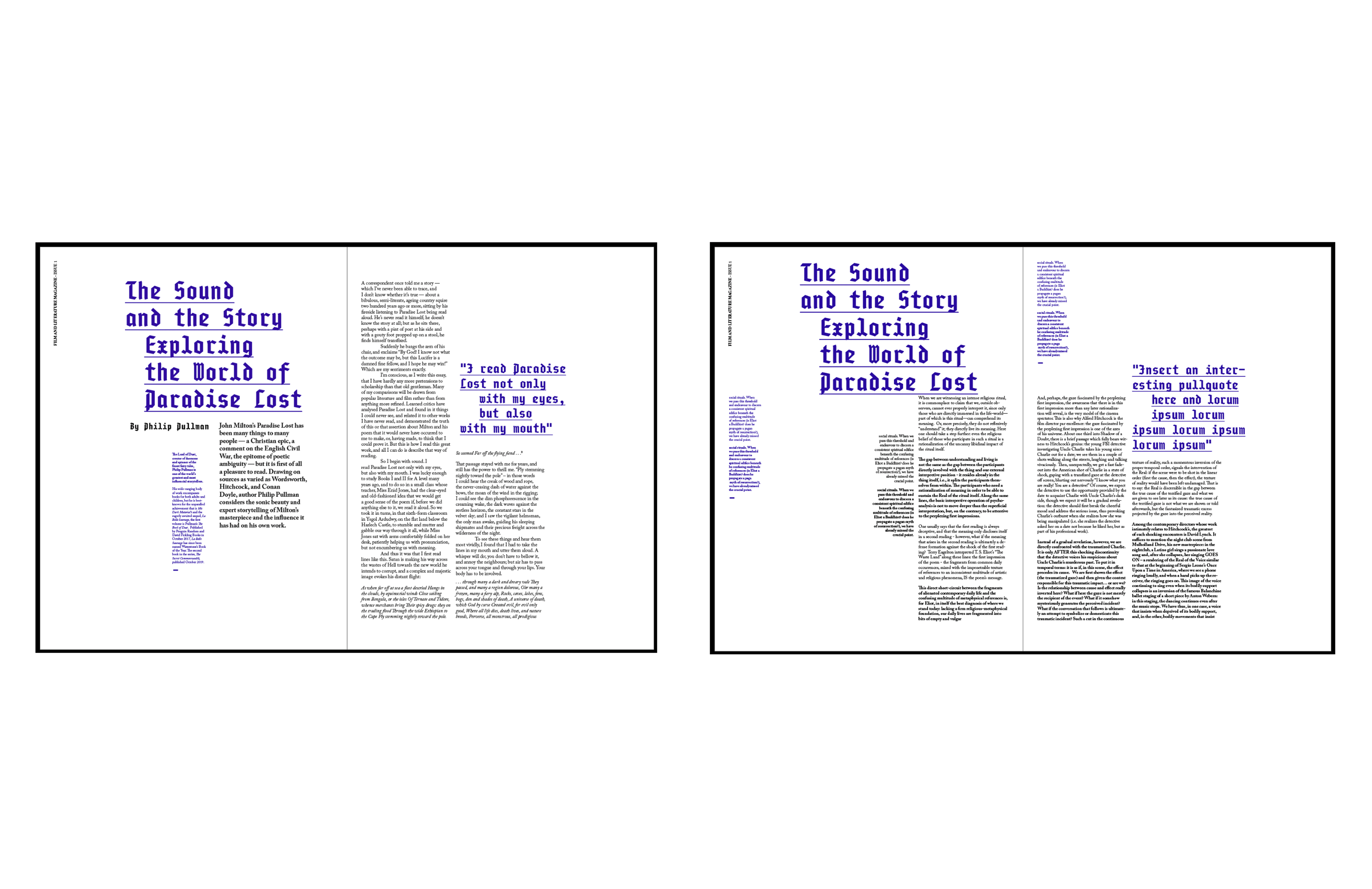
Pragmata Pro Fraktur has a geometric quality (since it is monospaced), a contemporary look to a Blackletter typeface that helps express the poem's gothic and dark themes. Because purple has been used throughout history for Royalty and is also used in Christianity, it is a fitting accent colour for the Prince of Darkness and a poem based on the Bible.
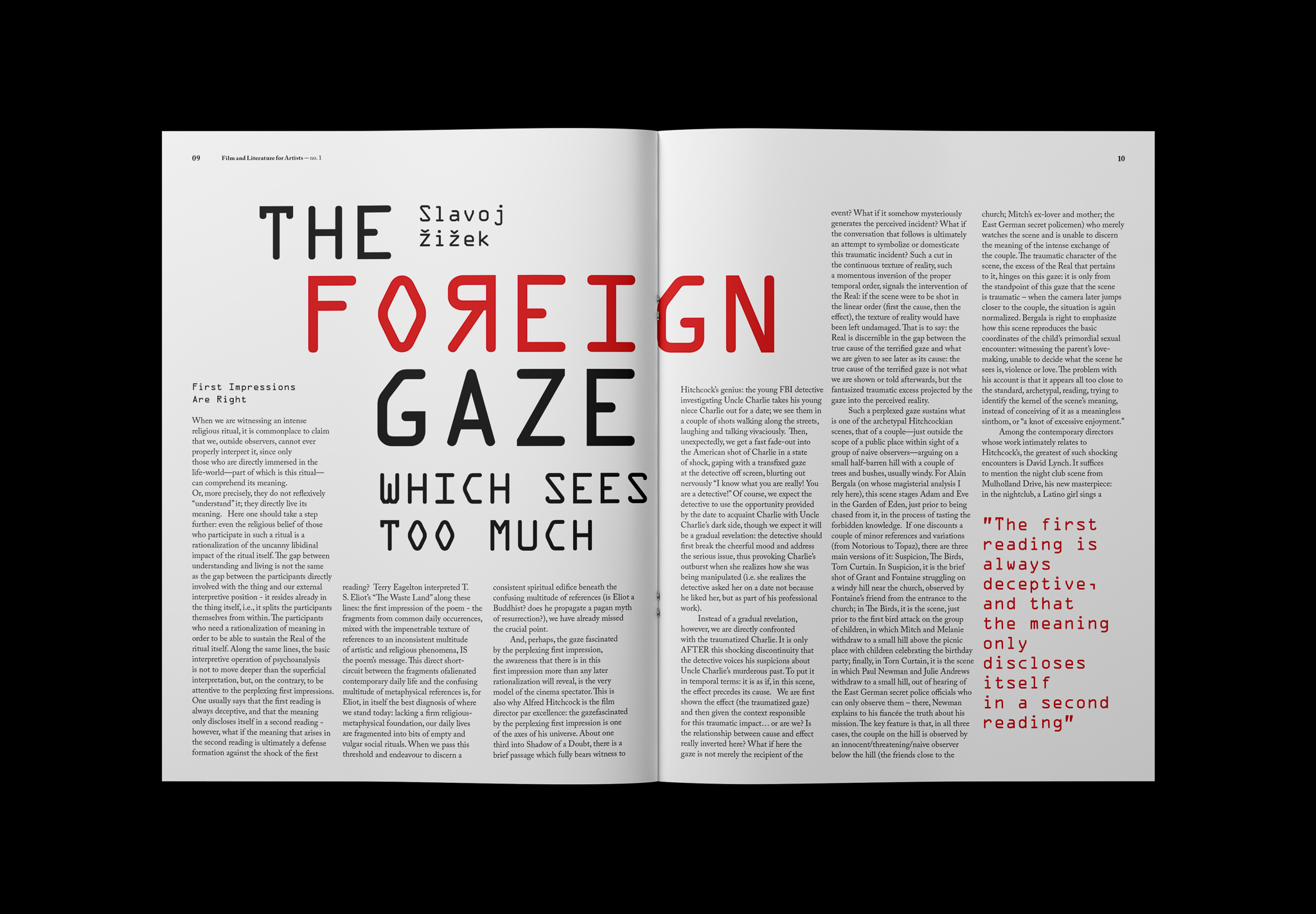
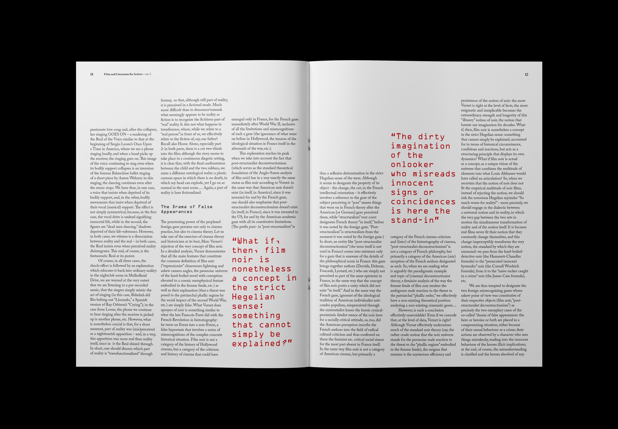
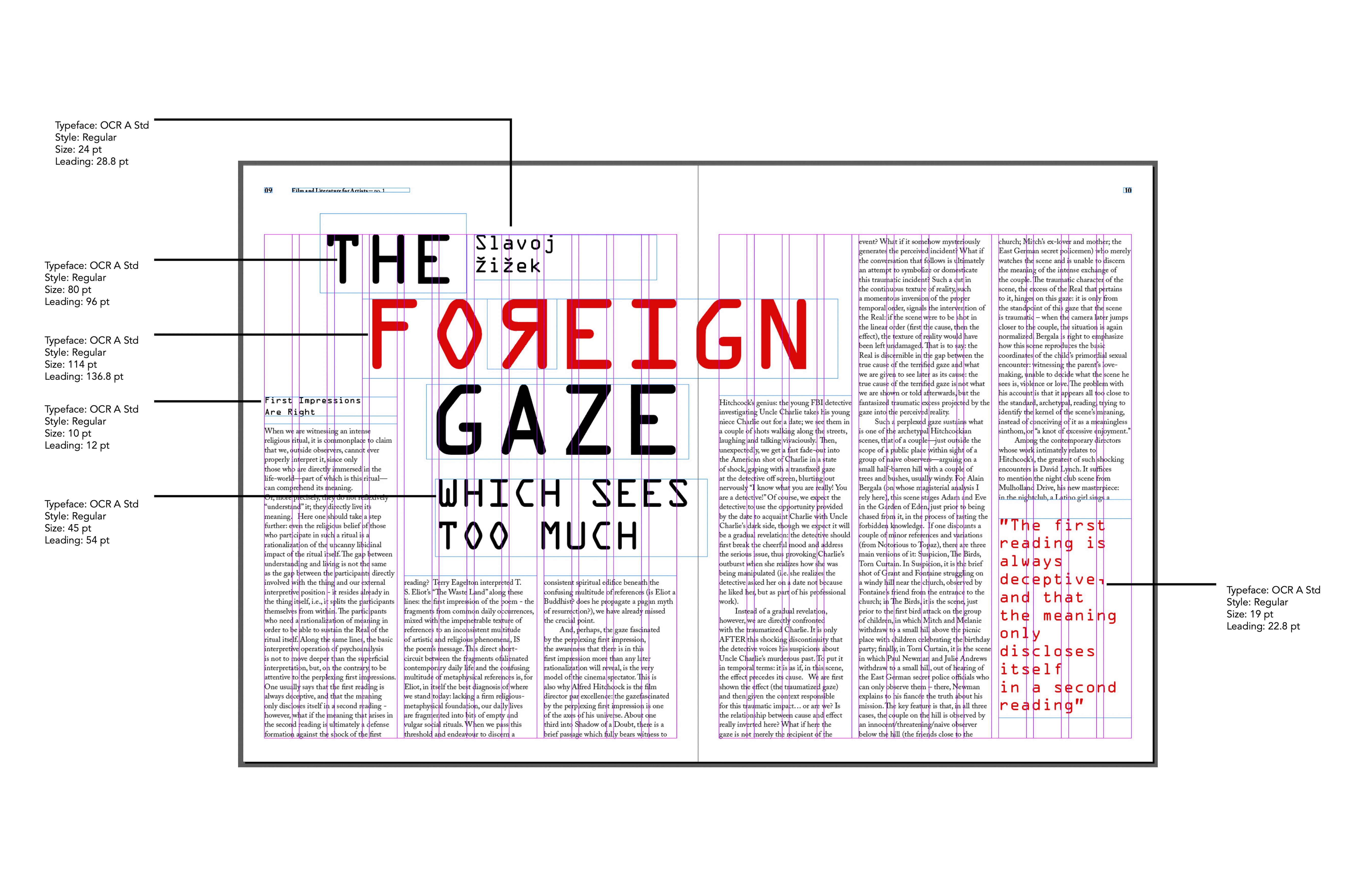
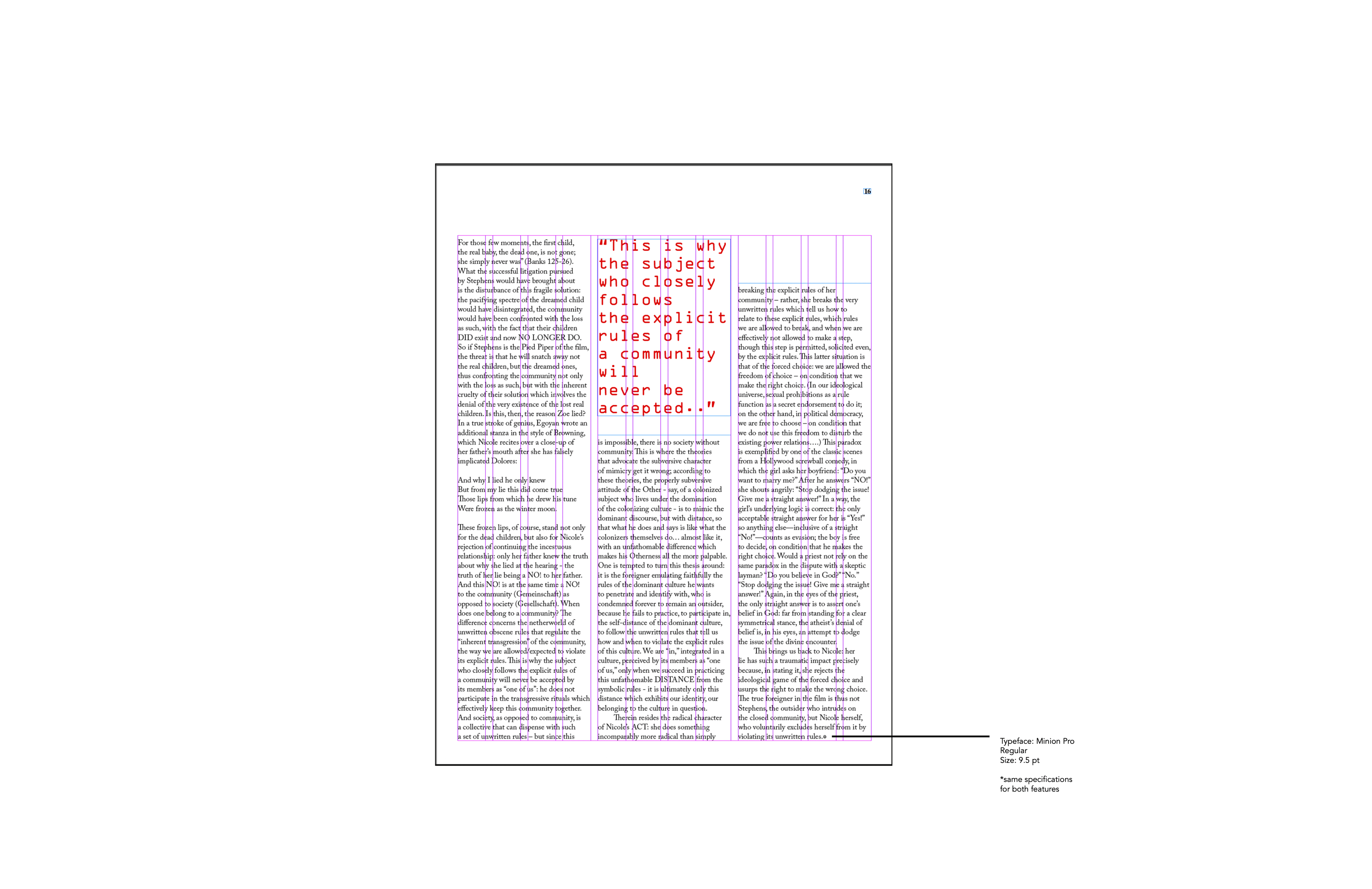
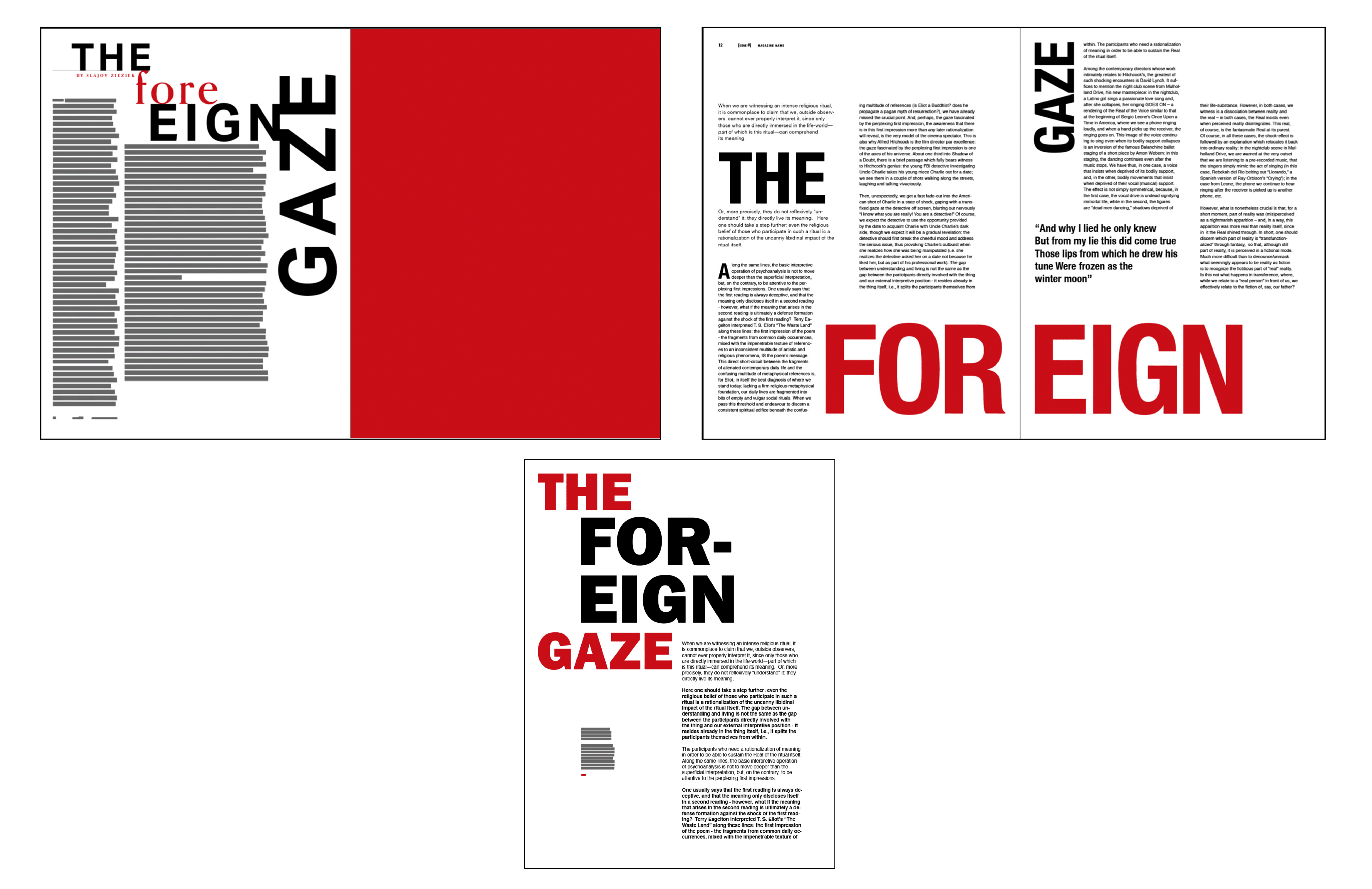
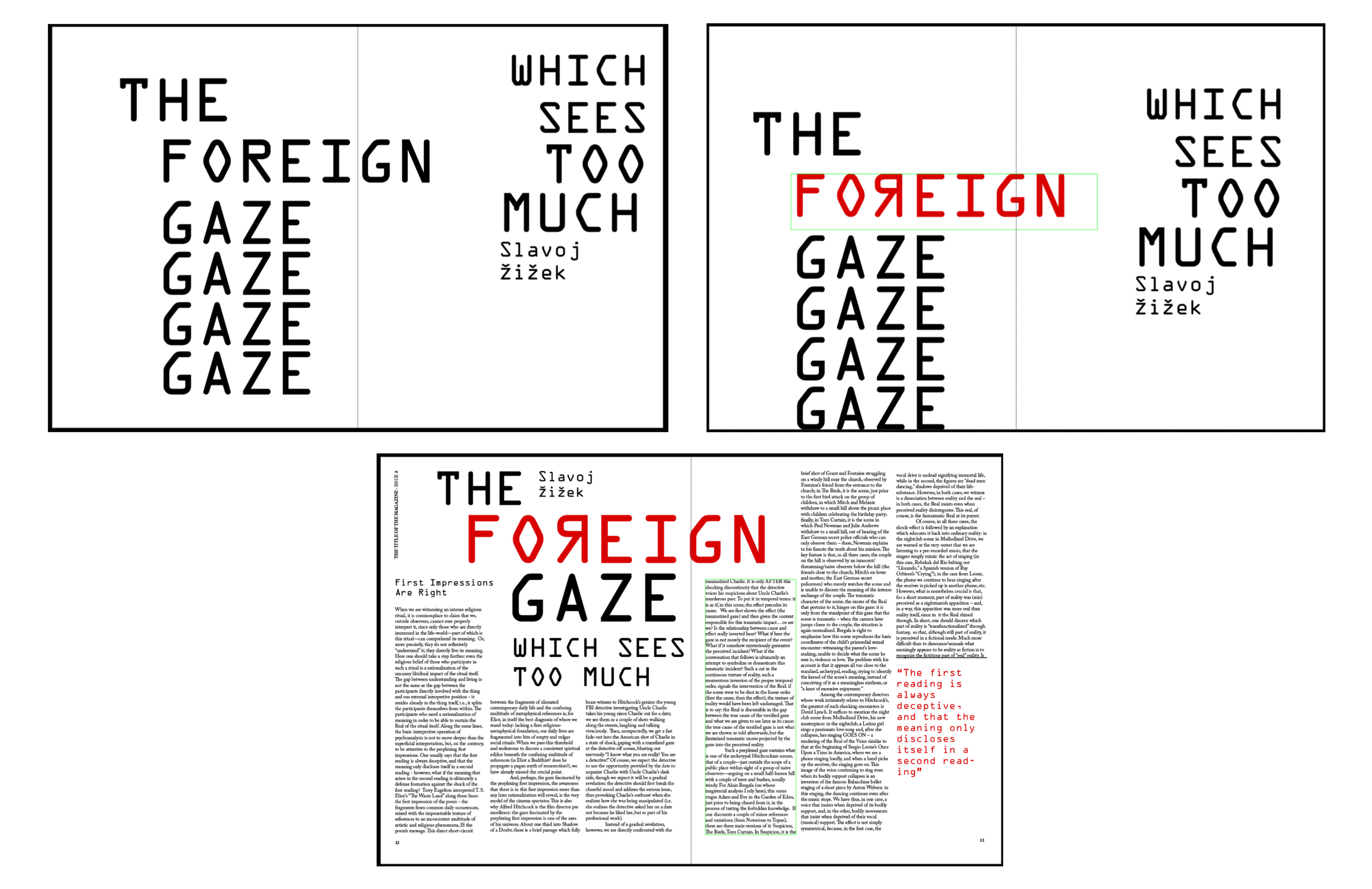
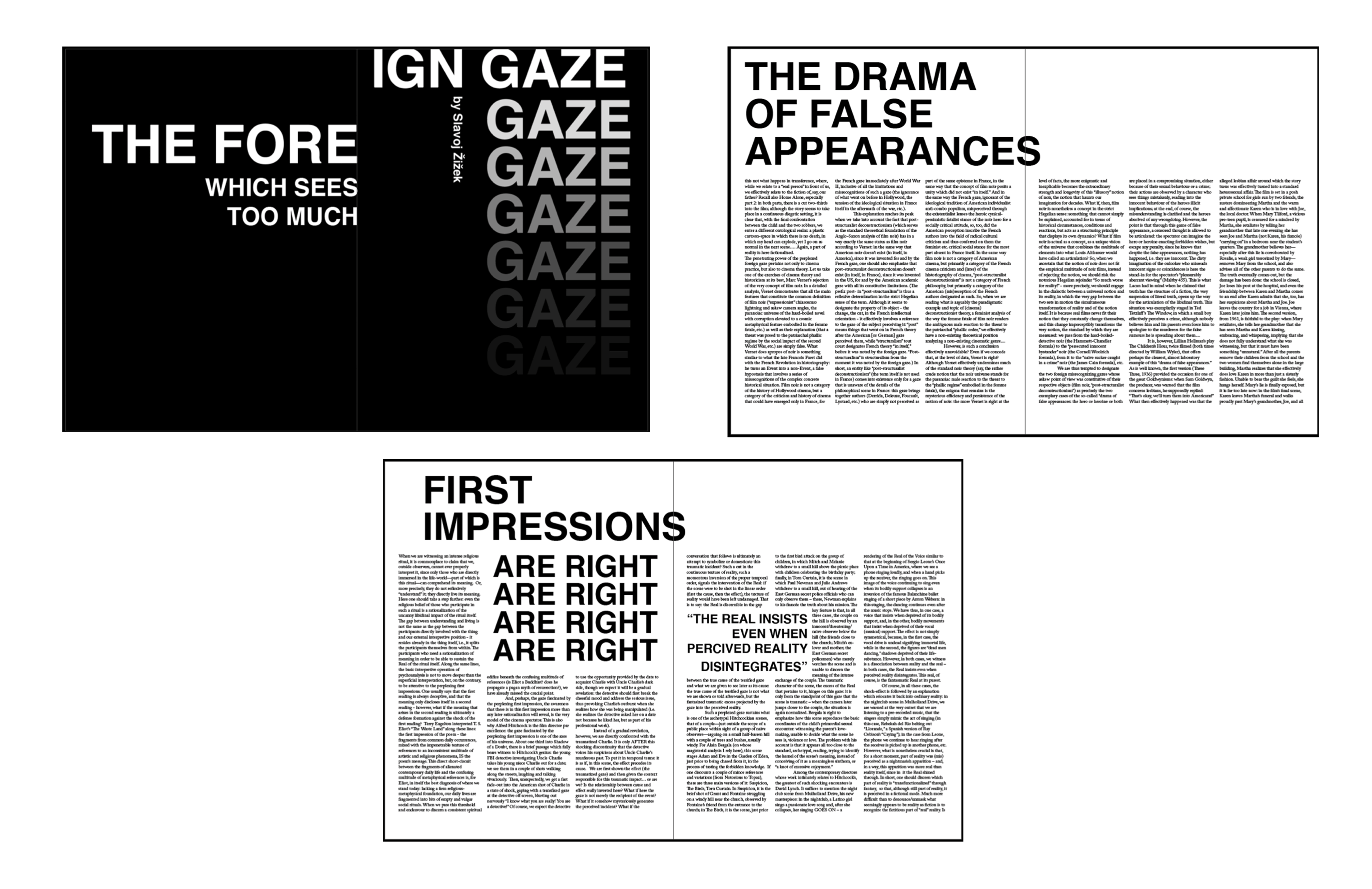
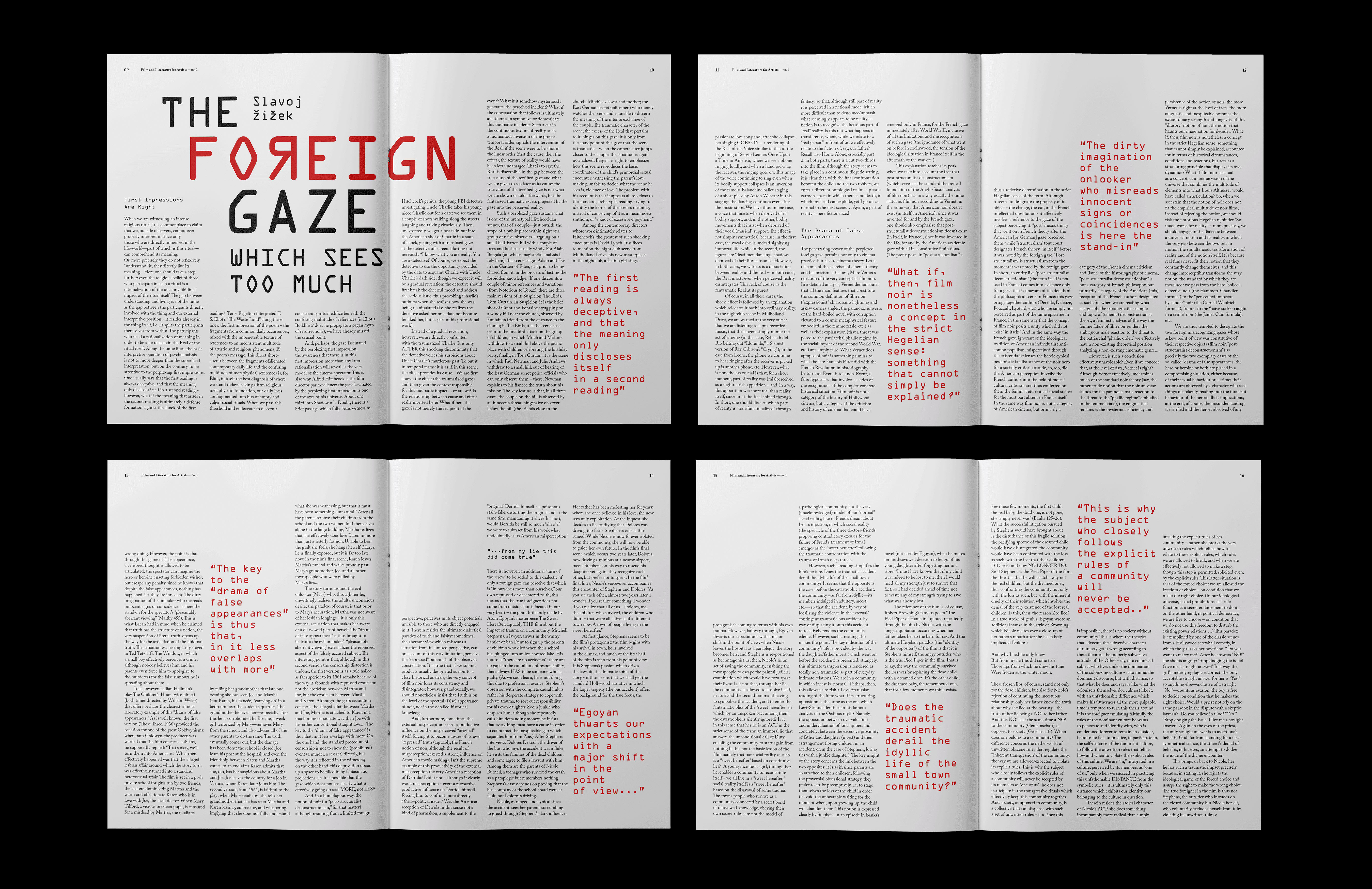
For the Foreign Gaze magazine feature, I designed modern and expressive spreads inspired by the tone of Slavoj Zizek's essay. The headline is on the verso page of the first spread, over the gutter and onto the recto page. The columns of text were positioned at varied hights to create interest. An end mark "fisheye" was added because of the title of the essay, The Foreign Gaze.
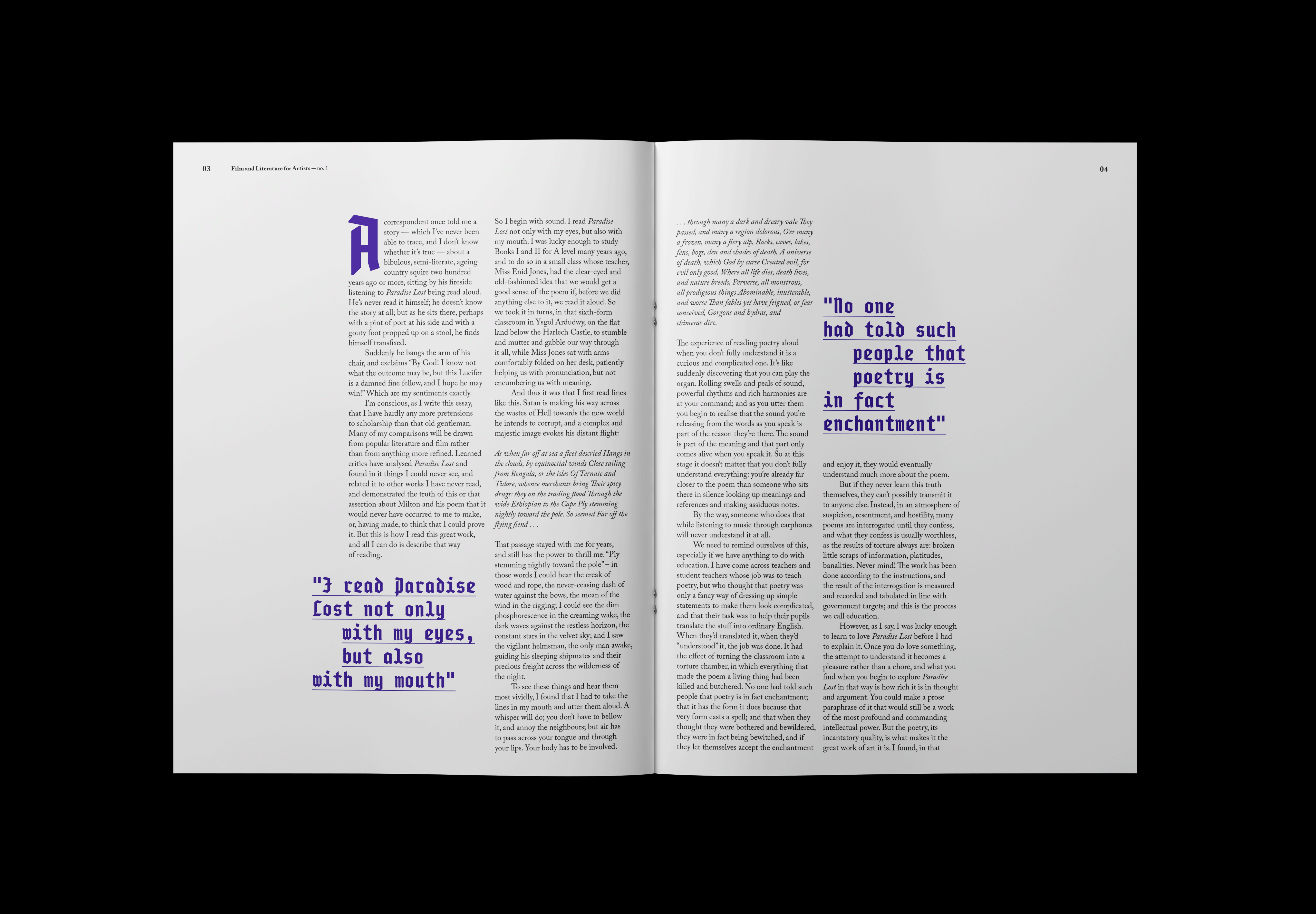
For the Sound and the Story Exploring the World of Paradise Lost feature spread, I was heavily inspired by the history of the poem being analyzed in the article: Paradise Lost. Since Pullman's essay was a critique of John Milton's Paradise Lost, I used unique a monospaced typeface that is inspired by blackletter type. I chose this particular typeface because it not only reflected the history of the novel, Paradise Lost, but it represented the connection between the old and the new, the oldstyle blackletter typefaces and contemporary, modern-day monospaced typefaces.
Feature Specifications
The typeface, OCR A Std and the flipped "R" character are fitting for the essay because the author has strong views that do not necessarily align with everyone's views. The headline typeface is contemporary and unique. The bright red and bold black are a nod to Zizek's communist views.
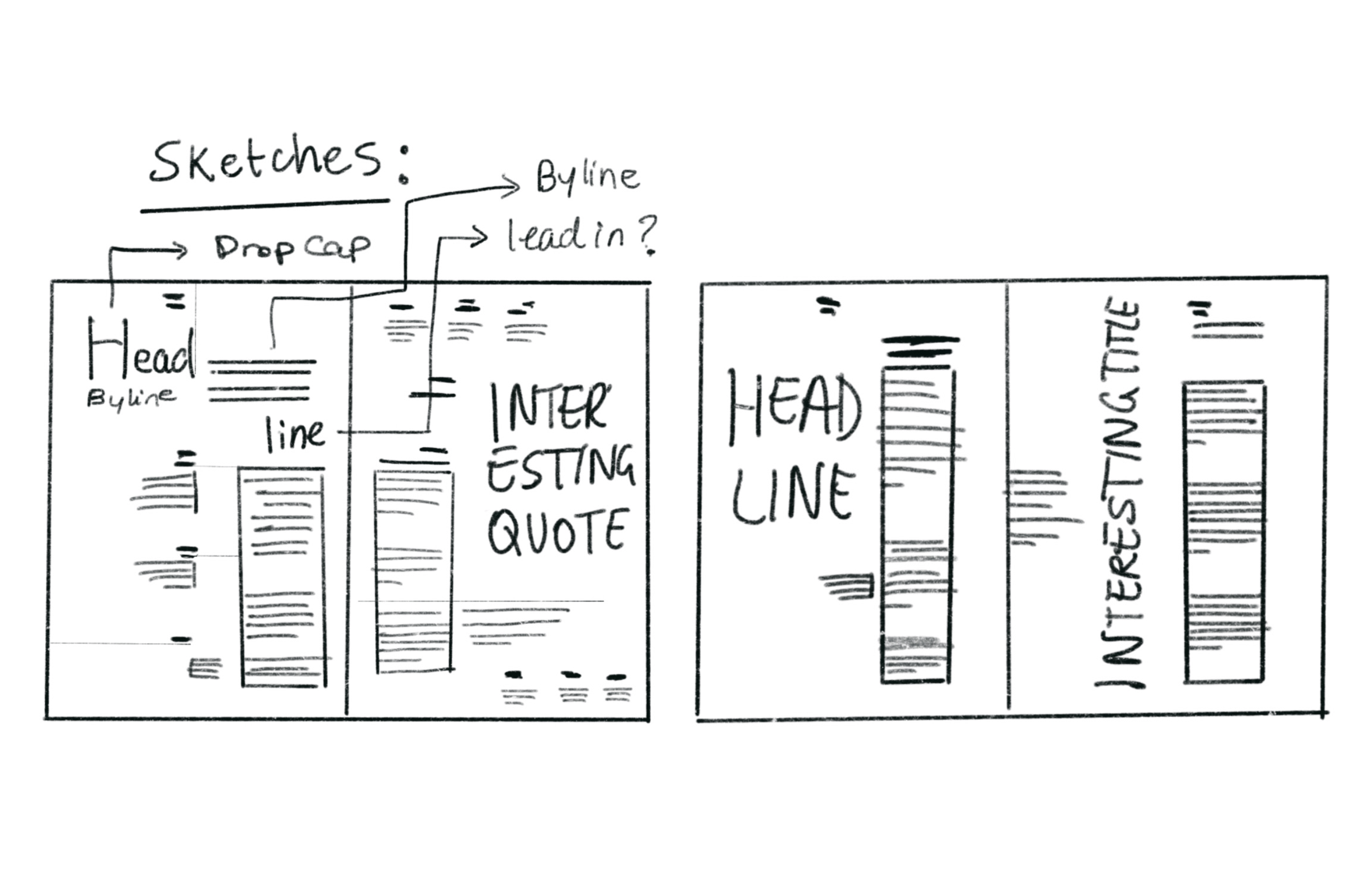
Much of the process behind these two features consists of experimentation with different grid systems and research of typefaces that express the feeling and meaning behind each essay.